Come Over To The Dark Side . . . Implications for Dark Mode on your Email Campaigns.
What is Dark Mode?
Dark Mode was introduced with macOS Mojave (10.14) released in the fall of 2018 and was quickly followed by a similar feature in the Windows 10 release last May. It’s an accessibility setting that changes the interface to display content with dark backgrounds and light color text. While it’s ideal for people with light sensitivity and minimizes blue light, it also enhances readability and reduces eye strain. When you switch a service, such as an email client to Dark Mode, it will automatically turn basic black text white and basic dark hyperlinked text to a brighter color. An IFL Science article indicates that Dark Mode on your iPhone could possibly save battery life by up to 30%.
How many people use it?
It has been a hit with consumers ever since its release and is only gaining momentum. According to this Medium article, a surprising majority of 82.7% polled preferred Dark Mode. A huge amount of these users said Dark Mode was easier on their eyes, elegant, nice to look at, and consumes less battery life on their devices. With Dark Mode, most operating systems allow you to toggle from Dark Mode to Light Mode depending on your environment or time of day, however, 74.6% of 201 users polled, kept their system on Dark Mode all the time.


What should I do to support Dark Mode?
There are things you can do to help ensure that you get a good email experience and be prepared for Dark Mode. Below, we cover the important areas to be aware of adjusting.
Logo:
This concept is simple, a few years ago, many brands got accustomed to the idea of using png images for logos rather than jpegs because this allowed for a transparent background behind the logo, removing that white box effect if your email had a differently colored background. But now we need to think a little differently with Dark Mode in the mix.

Add a white border around your logo. For those familiar with Adobe Photoshop or Illustrator, you can add a white stroke to your png logo to give it an added border and make your logo more legible in Dark Mode. In standard Light Mode, no one is going to notice the white border around the logo anyway.

Backgrounds:
Try to avoid using colored backgrounds whenever you can as this can make your email appear dated especially when your consumers read the email on mobile devices. For example, using a gradient with white in it as a background can cause a greatly illegible email when one of your consumers is using Dark Mode and it automatically converts black text to white!

Text formatting:
Be careful when controlling your font colors. Forcing your fonts to be black can make them stay black in Dark Mode, making them almost unreadable and customers will not likely switch to Light Mode just to read an email.

Adoption of Dark Mode Will Only Increase
As time progresses, more and more people around the world will either toggle to Dark Mode at night or start using Dark Mode continuously, so now is the time to be prepared for this additional facet of ever-evolving technology. In the past, we’ve said to test your emails on multiple email clients by sending tests to Gmail, Outlook, and Yahoo, and to test how the email looks on browsers and standalone email apps themselves.
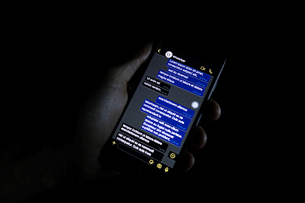
Now is the time to be prepared and to get a jump on this. Even marketing leaders aren’t prepared for this, see the example below that we recently received in our inbox:

We suggest toggling between Dark Mode and Light Mode when testing your emails to see how these look. Right now Outlook is one of the most widely used platforms that supported Dark Mode early on. Gmail on Android is also supporting Dark Mode, and you can bet that more clients will continue to add this functionality.
If you’d like help from us to get your emails ready for Dark Mode, just let us know.